How to visualize the impact of fake news
Post-Truth, as referred to in depth within Lee McIntyre’s book “Post-Truth”, has been a concept that populations have been wrestling with since the first published papers were cascaded amongst literate audiences. In accordance with Lee’s work, “The phenomenon of “post-truth” rocketed to public attention in November 2016, when Oxford Dictionaries named it 2016’s word of the year”.
Personally, this a growing concern due to how cumbersome it’s become to discern fact from fiction or satire. Sometimes it feels like all news sources are bias; each with their own agenda. Especially when a person in power tells you not to believe real sources like doctors or other experts. When I came across a dataset put together by Clément Bisaillon, which portrays the fake and real news coverage that occurred over the course of 2015-2018, it peaked my interest.
The challenge
After looking further into the dataset, I discovered some surprising gaps in data and surprising trends. The driving questions that led this inquiry included:
Which news sources were producing the most fake vs. real news?
How did the creation of fake news occur over time?
Did the creation of true news change in response?
My Role(s)
Data visualization specialist - cleaned the data in open refine, then synthesized it in Tableau to develop a meaningful data visual.
UX Researcher - conducted two moderated user tests to validate the usability of my data visualization.
Reporting - published a visualization in Tableau for others to re-use.
Our methods and tools
Data Cleansing and Visualization
These steps in combination enable small and large data sets to become meaningful visual narratives by ensuring that all of the necessary fields in a dataset are complete and have a consistent format.
Remote Moderated Usability Testing
This helps researchers evaluate a website’s user experience by learning about users’ mental models as attempt tasks in an interaction. Participants explore the visualization and answer questions to ensure that it effectively and aesthetically communicates the right narrative.
Tools
Kaggle: A website that hosts the largest open source data library.
OpenRefine: A software application used to cleanse and transform data.
Tableau: A software application used to create data visualizations and dashboards.
Dataset: Fake and real news
Limitations: Only data from 2016 and 2017 provided a meaningful comparison. Only fake news was collected in 2015 and too little news was collected in 2018; skewing the visualization.
Going from dataset to data visualization
Finding the Dataset
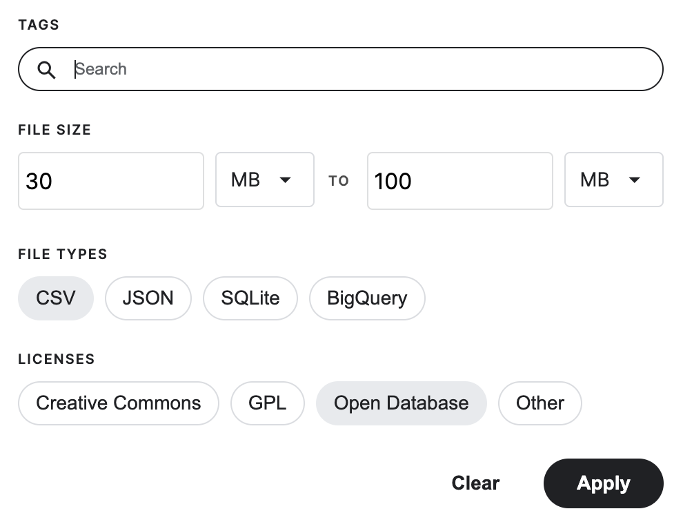
Searching for the data set in Kaggle was fairly easy to use for identifying a dataset due to its usability score and filtering based on:
File type
File size
Open Database qualification
This took more time than I anticipated because it required finding a dataset that provided a timeline vs. a point in time.
Figure 1: Kaggle filter options
Cleaning the Data
Once selected, I uploaded it into OpenRefine to clean and combine the two files provided by the dataset:
Fake.csv
True.csv
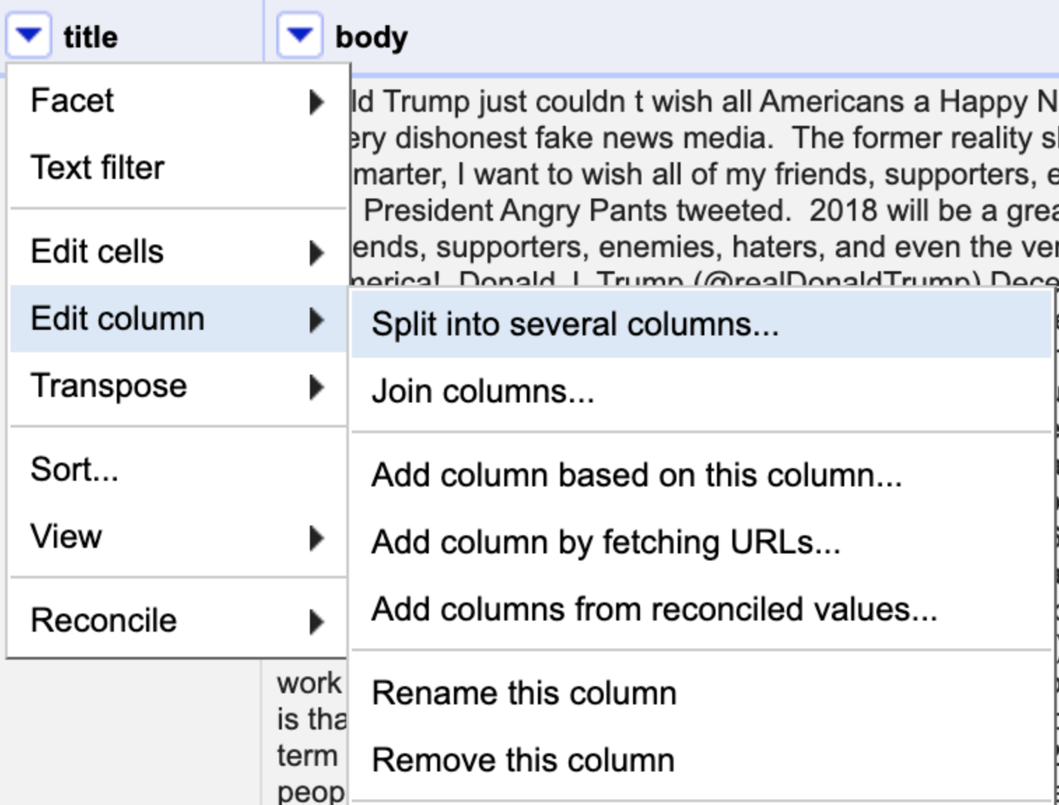
I was able to easily upload both files at once. Then, using “Split into several columns…” and “Rename this column” helped to clean up data elements such as the date format.
Figure 2: How to access “Split into several columns…”
The dataset files used the same headers and created a column to call out the files such as “Fake.csv” and “True.csv”. With the “Split into several columns…” feature, I easily deleted the unnecessary column text (ie.csv) in a few clicks.
Note: Some helpful videos that helped me through these strategies can be found on OpenReform’s Home page.
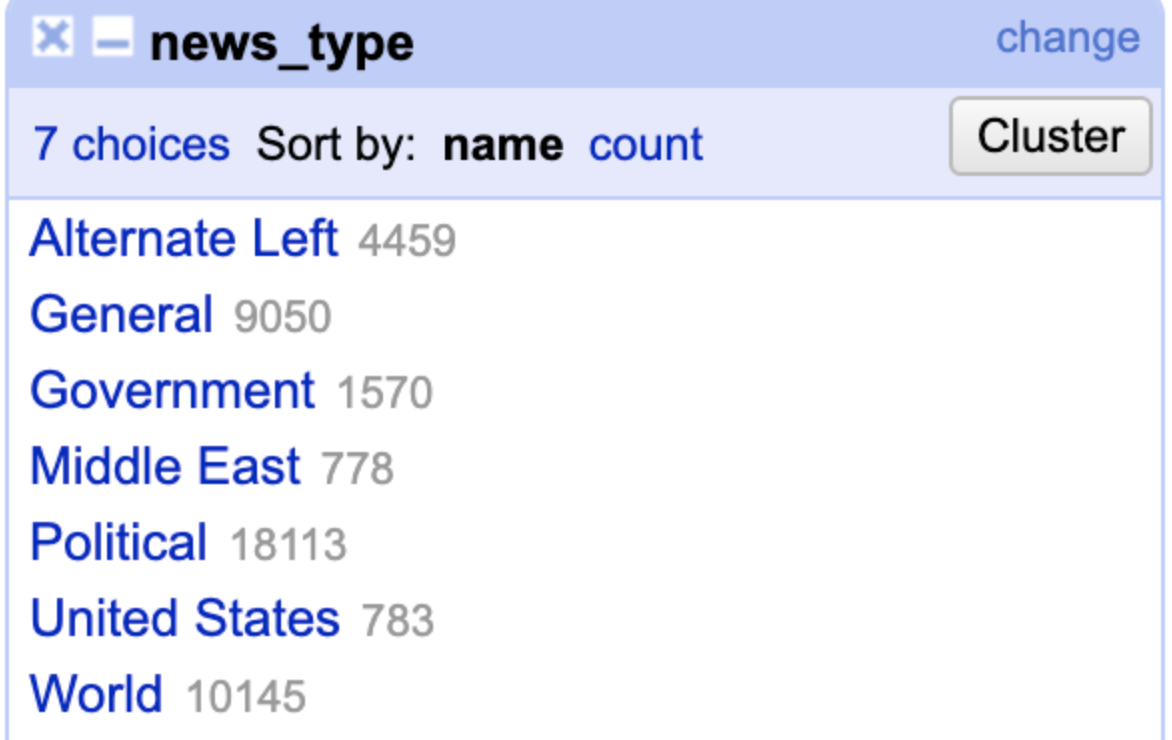
Using the “Text facet” feature, I identified the categories and then modified or combined duplicates as needed.
Figure 3: How you get to “Text Facet”
For example, I combined the “politics” and “politics_news” segments to create more consistent categories (see figure 4).
I also changed “News” to “General” since each source was inherently news, whether geo-specific like “US_News”, “World”, and “Middle-East”, or topic specific like “Government”.
Figure 4: “Text Facet” results
Lastly, the “Text filter” was used to identify and remove unwanted data: “null”.
Figure 5: How you get to “Text filter”
Making the Data Visual
Once I exported my file from OpenRefine as a .csv, I imported it as text into Tableau to visualize the data as a dashboard. The tool guides the user to select the appropriate visualizations made possible given the variables selected from the dataset. I chose the packed bubbles and the horizontal bar visualizations to easily view where the fake news was coming from and how abundant it was. Helpful features like the “Tooltips” allowed me to generate simplified hover-over text.
Figure 6: Tooltip editor for hover over text
Figure 7: Hover over text for data visual
I simplified the dashboard further by removing headers and other elements from the sheet view. I assigned colors to the true and fake news by separating the variable colors with the group variable feature:
Blue to signify the calming aspects of easily seeking the truth
Orange to evoke anger, which is how I feel about fake news
Designing the user test
Participants
Two participants were asked to explore the data visualization and answer a few questions.
Tasks + Questions
Scroll and click around on the data visual, what is the visual trying to communicate?
To see how users interpret the data based on the visual
What can you conclude from this information?
To ensure that the information is being communicated effectively.
During which periods were there higher numbers of face news?
To evaluate the effectiveness of the related table.
Do you think that this visual is good or bad?
To evaluate the aesthetics of the visual
Findings
What went well:
Users concluded the color choices represented the variables well.
The hover-over text was easy to understand.
The packed bubbles provided a helpful visual to understand the categories of news sources and the relationship generated over time.
What could be improved:
Users preferred it if the categories on the smaller bubble categories were spelled out. However, when text ran over the bubble width it looked cluttered.
The Result
Figure 8: Screenshot of the dashboard in Tableau
Using the packed bubbles, this visual allows the user to quickly assess which news sources generated the most fake news. Additionally, the horizontal bar graph shows the trend in content creation over the course of the first two years of the Donald Trump’s Presidency. This isn’t to fault the President, only a helpful observation to visualize the response of news sources to the rise in fake news. It could be assumed from these views that there was an intentional increase in true news content creation to combat the spread of fake news. It is also interesting to note the decrease of fake news between 2016 and 2017.
References
McIntyre, L. (n.d.). Post-Truth | The MIT Press. The MIT Press.


