Using eye-tracking to improve the user experience for buying online tickets to a museum
The Met’s Website: https://www.metmuseum.org/
The Metropolitan Museum of Art (Met) hosts over 5,000 years of art from around the world for all to experience and enjoy. In light of COVID 19, they added an experience for users to more easily plan a visit. Our team conducted an eye-tracking usability test to analyze how prospective museum goers navigate the Met’s website to plan their visit and buy tickets online. Through this study, we identified several opportunities to improve the Met’s Plan Your Visit and Ticketing pages.
The challenge
The Met’s “Plan your visit” page
The Met recently created a dedicated page to help users plan their visit. To evaluate the satisfaction, effectiveness, and efficiency of their current user experience we focused on the following questions:
Where do users look first? The video with the plan your visit button, the navigation, or the alert?
Where do users click most when navigating through pages?
How does the user navigate from the home page to the ticketing page(s)
Does the user readily find their applicable ticketing category?
Our Goals
To understand:
What information users seek out
Areas of friction when purchasing a ticket or reserving a time to visit
How users navigate the site to plan their visit
The Team
Alyssa Binda
Danielle Kingberg
Victor Chieng
My Role(s)
Project Manager - As a highly organized professional, I fostered face-to-face and virtual collaborative discussions documented on Google Docs, provided structure and methods to efficiently synthesize data in Miro, helped the team coordinate the communications along with moderated sessions, and organized meetings as needed.
UX Researcher - I moderated two eye tracking usability test sessions and helped gather data from Tobii eye tracking program. I also worked with the team to analyze the data, surface key findings, and craft recommendations.
Reporting - I assisted in building the presentation to piece together a compelling story that clearly informed the Met on how to improve their website’s user experience.
Our methods and tools
Eye-Tracking
This method helps researchers understand users’ visual attention. Eye tracker tools like Tobii allows UX researchers to observe where an individual is looking on an interface or in a space. This differs from other user tests because users perform Retrospective Think Aloud to recall their thoughts while watching a playback of their actions taken to complete each task. For good qualitative metrics in eye-tracking studies, it’s best have at least six participants.
Tools
-
A tool used to track the eye movements of users. In this case, from a desktop device. This allows us to see where users click and also where their eyes fixate or scans information to understand where they’re focusing their attention and the information they miss.
-
A tool used to reliably assess the overall usability of a website through a 10 item questionnaire.
-
This powerful online collaboration tool helped us document and synthesize our findings in one place for affinity diagramming to uncover trends. Access our Miro board from here.
-
This online spreadsheet tool allowed us to analyze our quantitative metrics from Tobii and piece together a list of key issues and recommendations we identified.
-
This is a powerful data visualization tool that we used to make some of the graphical components of our quantitative findings.
Metrics
Events: To quantitatively indicate in Tobii where users clicked or looked on each page throughout the task portion of the usability test.
Times of Interest: The length of time for a given user flow. For example, how long it took them from the point of entry to the ticketing page to purchasing a ticket.
How we designed the eye-tracking user test
The Met’s audience was defined as students or out of town visitors. In alignment with the goals and key questions we created a test with the following parameters:
Participants
We had ten participants based on their interest in museums and feasibility based on body/eye constraints (See Limitations). Most were students in the Information Experience Design or Library Science programs at Pratt Institute (see figure 1). 80% of participants have been to the Met at least once and frequent museums a few times a year.
Figure 1: Participant’s area of study
Scenario
Participants were told to pretend they were are a tourist interested in visiting the Met this week and would like to find information about the Museum in preparation for their trip.
Tasks and rationale
Take a minute to explore the Met’s website.
To understand where users look first. Using Tobii we could visually track where users focused their attention and scanned first on the page vs. where they say they’re looking. This also helped to analyze how users navigate through natural behaviors and inclinations. For example, we could extract quantifiable data on how many prefer to scroll down on the page first vs. clicked on the top navigation bar, or a button embedded on the page to explore the site.
Find the latest reviews about the exhibition “In Praise of Painting: Dutch Masterpieces at the Met”.
To understand how users navigate the website by assessing the effectiveness of their clickthrough buttons vs. the navigation or search bar on the individual pages. This also helped to analyze how findable the information about the exhibit and confirm it’s valuable to the user’s decision making process when determining which exhibitions to see.
Determine if this exhibition is included with admission.
Not all museums include all exhibits in their ticket like the Met does. This task was intended to surface if this information is easily found on the exhibit page and matched the mental model of users planning their visit.
Pretend you’re getting tickets for you and a friend to visit the Met, this Saturday, at 11AM ET for this exhibition.
To understand how users navigate through the ticketing process and determine what ticketing information users specifically sought out, areas of friction throughout the process, and how they navigated the site to purchase a ticket. These findings would allow us to assess if users could readily find their applicable ticketing category.
Initial Insights
The Met has a very user friendly site
Based on research, a System Usability Score (SUS) above a 68 is considered above average. The Met’s website scored 84.4, which is 96.9% higher than most websites.
Where users look first
This heatmap confirms that users are drawn to the video images of the site along with the vaccination alert text beneath the navigation bar and of course, the options on the navigation bar.
Once ticket option is identified, steps to purchase are clear
Most users feel that the steps to purchase a ticket are clear. Our TOI for ticket completion indicated participants take 1.26 minutes on average to complete the online ticketing form.
Navigation preference is varied
When users have a specific task in mind, 100% prefer using top navigation to take action. However, when exploring a page without specific a purpose, 60% scroll down on the homepage.
Users click the closest button
All users clicked ‘Plan Your Visit’ first, 90% clicked ‘Buy Ticket’ within the Plan Your Visit page. This tells us that users prefer to use buttons in closest proximity to their spot on a page.
4 improvements identified
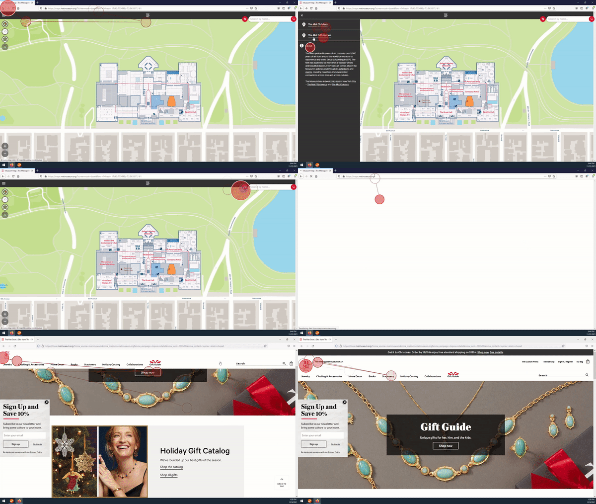
We identified confusion on ticket locations, Plan Your Visit vs. Buy Ticket pages, ticket categories, and navigation to main page from the Interactive Map and Shop. Click to view larger reel.
Why did users have difficulty in navigating back to the Met’s homepage?
While exploring the website, users had difficulty in returning to the Met’s homepage when they accessed the interactive map and shop pages. They used their browser history to go back (see Figure 1).
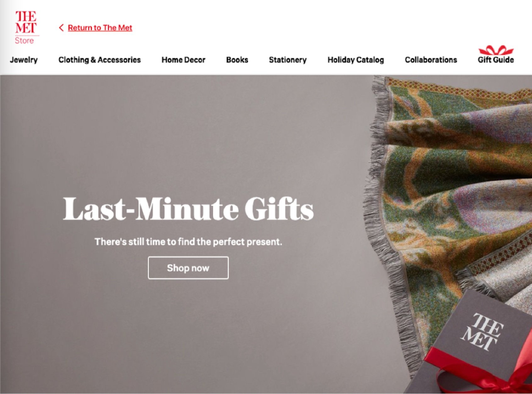
The hyperlink on the shop page to return to the homepage, “The Metropolitan Museum of Art”, did not appear clickable (see Figure 2).
Figure 2: The the button back to the Met’s homepage from the Shop page.
How can the Met make it easier for users to return back to their homepage from the Shop and Map pages?
Change the copy of the link and make it more prominent. This will reduce confusion by having text that is more aligned to hyperlinked text conventions so users will be able to identify how to get back more easily.
Figure 3: Recommended text to return to the Met Homepage
What made users click on Buy Ticket vs. Plan Your Visit?
Throughout the tasks, the Plan Your Visit page had very little interaction. All users looked for the “Buy Ticket” button eventually to find the pricing details.
The information on top of the ticketing page was also duplicate of content found on the Plan Your Visit page.
Figure 4: Video of user determining whether to select “Buy Ticket” vs. interact with the “Plan your visit” page
How can the Met make it easier for users to find relevant ticket pricing details?
Combine the content from the Plan Your Visit page onto the Ticketing page as a sticky element on the right so users can access the pricing information more easily in the ticketing process. This will reduce churn for users by giving the information they need to make informed ticketing decisions and eliminate the need to maintain two pages with similar content.
Figure 5: Content from Plan Your Visit onto Ticketing page as a sticky element
Change the Call to Action (CTA) buttons on each page to Buy tickets so users can get to their goal of ticket purchase faster.
Figure 6: Recommended CTA change to Buy tickets
What kept users from selecting the right ticket option?
Users found the content available difficult to read. Chunks of text were too cumbersome to find the right information to tell them which ticket option to select.
Almost all users were confused about which option to select because they were looking for the museum’s “Pay as they wish” policy, which is not currently on the ticketing form.
One participant mentioned, “I don’t normally purchase my ticket online because I can show up with my student ID and pay what I want”.
How the Met can provide the right ticket option and the right information needed at the right time.
Add a conditional ticket option for NY residents and NY, NJ, and CT Students to allow users to pay what they wish ( > $.99). This will reduce confusion by aligning to how users pay to visit onsite; enabling them to purchase tickets in advanced and accommodate for COVID capacity restrictions.
Add help text to warn users on what’s required to avoid paying the full admission amount. This will reduce churn by providing the right information when users seek it in one place.
Figure 8: Recommended ticket option
What kept users from selecting the right location for their ticket?
70% of users got confused when they needed to select the location for their ticket admission.
30% of users looked for the exhibition’s location to determine their ticket location.
10% of the users were confused why the Cloisters location appeared as an option, expecting it to be a part of a separate checkout experience altogether.
How the Met can make it easier for users to select the right ticket location?
Modify dropdown options from “Exhibitions” and “Events” to “Fifth Avenue” and “Cloisters”. This will reduce confusion for users by aligning the location names to the options shown in the ticket selection process.
Figure 10: Recommended dropdown menu options under “Exhibitions and Events”
Add exhibitions icons in the Location during the ticket purchase process. This will make it easier for users to recall which exhibits are at each location; giving them the information they need, where they need it, to make a decision.
Figure 11: Recommended approach to add exhibit icons for selecting the Location section in the ticketing process
Conclusion
The Met’s website: Overall it’s very user friendly. Implementing our team’s recommendations will help reduce user confusion, streamline the ticketing process and make it easier to navigate the website.
Client feedback: The Met’s Product Designers had lots of great questions about how we approached our study and their feedback was very positive. They found our findings very helpful as they re-think the purpose of the Plan Your Visit page.
I think this is great! The information about Plan your Visit and Buy Your Ticket pages was really interesting!
— Tabia Smith, Product Designer for the Met
Lessons learned
The retrospective think aloud (RTA) component of eye-tracking can be challenging because it requires additional probing for participants to talk through their experience and pin point areas to inquire further. The disconnect caused by the delayed reflection also caused participants to forget why they clicked or looked on parts of the interface; making it difficult to surface insights. Next time I would pay closer attention during the pilot stages to think through and test questions to make the RTA component more fluid.
Limitations
Quantitative Metrics with Tobii: Due to image rendering issues, we could only record the sessions using screen share vs. the actual website for eye tracking. We couldn’t use some of the quantitative analysis capabilities that Tobii offers such as Areas of Interest (AOIs) and Gazeplots. While we used some quantitative metrics, most quantitative capabilities that Tobii offers like heatmaps are better suited for studies with 30-40 participants.
Participants: This study required in-person testing. Due to the stringent health and safety measures on campus for COVID 19, we were encouraged to recruit Pratt Students as participants since they were all vaccinated and tested negative. Participants also had to be able to:
View their desktop without the assistance of glasses or contacts
Sit relatively straight in a chair without fidgeting or moving too much
Recent updates to the Met’s Ticketing page
The Met simplified the text above the ticket options to make it clearer for students to know if they should purchase their tickets in advance. While this change did not directly align with our recommendations, this taught me that there can be simpler ways to resolve a problem which was clearly presented in our research.
Figure 12: Ticketing page prior to Jan 1, 2022
Figure 13: Ticketing page post Jan 1, 2022
References
Bergstrom, J. R. et al. (2014) Eye tracking in user experience design. Waltham, Massachusetts : Morgan Kaufmann, 2014.
How To Use The System Usability Scale (SUS) To Evaluate The Usability Of Your Website. (2015, July 13). Usability Geek. https://usabilitygeek.com/how-to-use-the-system-usability-scale-sus-to-evaluate-the-usability-of-your-website/
Learn how to set up and use Times of Interest—Tobii Pro. (n.d.). Retrieved December 16, 2021, from https://www.tobiipro.com/learn-and-support/learn/steps-in-an-eye-tracking-study/data/Digging-into-intervals-and-Times-of-Interest/


